 |
| My photo tutorials are made for the screen |
Great page layout.
Easy to zoom in.
Great for storage.
I have signed up for the Etsy Holiday Boot Camp 2015 and have been exploring my target audience this week. It is always good to think about why you are selling and who you are selling to.
When I started up my shop I had a very specific audience in mind - someone like me!
The point of my shop was to share my patterns with like minded people.
My original audience looked like this:
- Likes to sew
- Wants a variety of 18" or 20" doll clothes
- Wants a low price but doesn't what to sacrifice quality
- Has a computer or iPad in the sewing room
- Wants detailed instructions that are computer and iPad friendly
- Doesn't want to print out instruction pages
No surprise that doll clothes makers are generally not looking for iPad friendly instructions. Many seemed to have a preconceived idea that instructions are made to be printed out and filed somewhere.
Hence the feed back that 'There are too many pages to print' or 'The pages don't print properly' or 'It looks too complicated'. I think this last comment was because there are so many pages in the photo tutorial - I love open space.
I never intended the photo tutorial of many pages and lots of open space to be printed. The colour scheme is not made for printing and the file is too large for many printers to handle. Printers usually upload all the data before trying to print it and if your printer doesn't have enough memory to deal with 10MB you end up with half pages or only some pages being printed.
So I am listening. I really want to share my patterns so I have been working on a format that more people are happy with.
First of all I put the text from the photo tutorial into a text only format. This still took up too many pages so I have had to summarise a bit and leave out some of the extra details. I have added this to some of my patterns and I am still working on improving the look of it.
Secondly, I have created a Pictorial Tutorial. 2 or 3 pages of diagrams to show the steps with minimal words. Not everyone is into words like I am. Diagrams are very concise - a picture tells a thousand words type of thing. I thought it might also make the patterns more child friendly.
Thirdly, I have divided the pattern into 4 separate files so there is no confusion about what can be printed.
- The photo tutorial
- The text only pages
- The pictorial tutorial
- The pattern pieces and extras
Do any of my patterns look like this yet? No. Not yet, but I am working on it.
The first one to get the make over will be 1804 Snugfit Carol - a Round Neck Dress.
Some of my patterns have some of these features already but not completely. 1801 Knitfit Lucy - a Collection of Classic Knit Tops has the text only pages and the pictorial tutorial but the files are not divided up.
 |
| 1801 has the photo tutorial, the text only and the pictorial tutorial as well as vector drawn pattern pieces. |
It will take some time to get all the instructions up to speed. The pattern pieces haven't changed. They already fit great and look good.
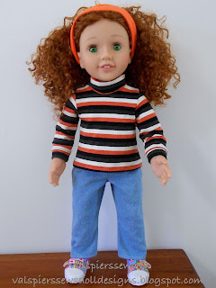
I don't like to spend all my time on the computer so in between I am working on more patterns. At present it is the 20" Australian Girl Doll version of the knit tops. 2001 Knitfit Lucy.
Happy Sewing,
Val


No comments:
Post a Comment
Note: Only a member of this blog may post a comment.